
It’s a tough pill to swallow when you realise that your company offers a great service but are struggling to stand out amongst the often-flooded and content-saturated marketplace – but, it’s even tougher to actually do something about it.
Please welcome Mercury Energy to the stage...
Not only did the Marketing Team behind Mercury Energy realise that the business needed a drastic change to communicate that they offer more than just power at a competitive price, but they went and did it – well. Really really well.
Retrieved from Stoppress.
Around a year ago, the marketing team behind Mercury Energy felt that they had to find a way to offer more than just price.
The problem, however, was that the old setup of Mercury Energy retailing electricity and its parent Mighty River Power generating it, had lost salience with consumers.
While both brands were well established and trusted, they were considered old-fashioned and traditional. This antiquity was perhaps best summarised by the old Mercury Energy logo, which featured the Roman God Jupiter wielding a lightning bolt. It just wasn’t quite as relevant as it once was.
What’s more is that consumers couldn’t connect the dots between the two organisations; despite depending on one another, Mercury and Mighty River Power were seen as independent companies.
Mercury chief marketing officer, Julia Jack knew that if the company was to extend its competitive advantage beyond price, the team would need to ameliorate the lack of salience and cohesiveness in the brand.
More than a logo.
Rebranding efforts can sometimes be reduced to simply slapping a new logo onto an existing brand and leaving everything else unchanged. However, this was not such a case.
From the outset, Jack and her team knew they had to do more than retire the long-serving Roman God. So, they set out to completely transform what the brand represented and give New Zealanders something they could actually believe in.
Mighty River Power and Mercury were conflated under a single banner, removing all doubt that the companies were related. The old brand livery was replaced by a slick new design, featuring a simple illustration of a bee. And, the company rolled out an eye-catching campaign that starred a young New Zealand woman easily navigating the nation’s hilly terrain with the help of an e-bike. None of these decisions were random.
“Mercury, and we engaged them every step of the way – including choosing our bee logo,” Jack recently said in a statement celebrating the first year of the new brand.
The symbol of the bee along with the e-bike played beautifully into Mercury’s positioning as a power company that relies only on renewable energy sources. It was a classic creative example of showing rather than telling.
Mercury showed it cared by placing emphasis on a creature integral to environmental sustainability and by becoming a champion of e-bikes.
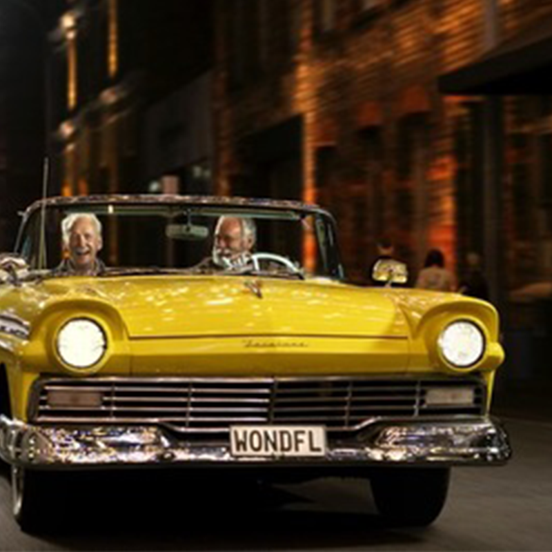
This narrative was used together under the new slogan ‘Energy Made Wonderful’, an infectiously positive platform that strives to show how sustainable energy can make the world a better place.
“Our customers are voting with their feet by choosing to stay with us in record numbers,” Jack says. “That’s the real sign that our brand and how we put it into action is hitting the mark.”